The new MLS season is here and so is a new batch of kits for every team in the league. This year, we’re handing out superlatives for each new design (and lumping together all the ones that offer little more than the current template from leaguewide kitmaker Adidas).
Every team has one new design this year that will be paired with the kits that were new for last season. The only exceptions to that are San Diego FC, which is embarking on its inaugural season, and Inter Miami, because of the existence of Lionel Messi. So let’s start there.

GO DEEPER
Our thoughts on every new MLS kit for 2024
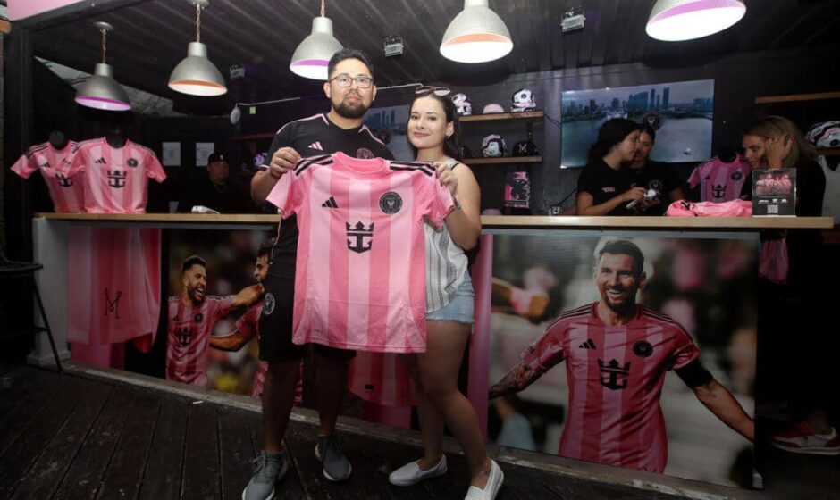
Most popular with 10-year-olds: Inter Miami “Euforia” and “Fortitude” kits


Brooks: Every year I say I’m disappointed that Miami doesn’t better utilize their excellent color scheme and south Florida style to create more interesting kits, but not this year! Even after their excellent Archive Collection kit last year that finally fulfilled that wish, I’ve lowered my expectations. The vertical stripes on the Euforia kit kind of give the pink shirt a fitting Argentina element, but it doesn’t really matter what these shirts look like. As long as Messi is wearing them, they will remain the ultimate in elementary school fashions.
Most Los Angeles Chargers look: Philadelphia Union “Voltage” kit

David: This is the kit most likely to look the best on Justin Herbert. This design kind of gives off a “pick which flavor of sherbert you want” vibe, but the isolated snake logo is a nice touch.
Brooks: The shirt looks like a warm-up top to me. That’s not necessarily a criticism. It just feels like it should be the shirt before the shirt.
Most disorienting: Orlando City “Perfect Storm” kit

Brooks: The design on this shirt is headache-inducing, but that’s not a bad thing. Why don’t more teams across all sports wear clothing that will make their opponents seasick? This is a legitimate competitive advantage.
Most disappointing: Columbus Crew “Goosebumps” kit

Brooks: I love the concept — Goosebumps author RL Stine is from Columbus — but the execution just doesn’t quite come off. I can’t really put my finger on why. Maybe it’s the Crew yellow instead of Goosebumps green, but it just kind of makes the person wearing it look like they’re leaking radioactive goo. It definitely would’ve been better if the shirt featured a giant sublimated image of an evil ventriloquist’s dummy.
The Rec League Kits: San Diego FC “Woven Into One” and “State of Flow” kits, Austin FC “Heartbeat” kit, FC Dallas “Inferno” kit, LAFC “Secondary” kit, Nashville SC “Heart of Nashville” kit, Houston Dynamo “Season 20” kit, Minnesota United “Convergence” kit
Brooks: All these kits utilize Adidas’ current template and do little to stand out. For that reason they look like kits you’d see in your local indoor rec league on a Tuesday night after work. In other words, they look like shirts that would be worn by sweaty people debating whether they should go for a post-match drink at Chile’s or Applebees. Have a look.
San Diego (caveat: new clubs usually don’t have enough runway to get customized kits for their inaugural season and that seems to be the case here):


Austin:

Dallas:

LAFC (the collar detail on this one is a nice touch, though):

Nashville:

Houston:

Minnesota:

Most likely to make your kid ask if cars can go to heaven: Chicago Fire “Municipal” kit

Brooks: There’s a cloud-like ethereal vibe to this one that’s topped off by the Carvana logo. It just raises a lot of existential questions about automobiles, the afterlife and whether a Ford Taurus can experience eternal bliss. There could be more difficult questions being asked than usual when you watch the Fire this year.

GO DEEPER
MLS preview roundtable: Staff predictions for the 30th season
Most tenuous connection between design and club: New York Red Bulls “Stone” kit

“The kit is inspired by the architectural grid pattern that originated at Stone Street in Manhattan and embodies the continuous growth of soccer culture across New York and New Jersey’s urban landscape,” according to MLS but it’s hard to get any of that from looking at it. This kit just looks very beige, which is an unusual choice for a soccer uniform. At least it is in any other year…
Most underutilized design: D.C. United “Soul” kit

Brooks: The pattern that’s relegated to the fringes of the template is unique, but it just gets drowned out by the beigeness of the rest of the kit.
David: The creamsicle vibe doesn’t quite go with D.C.’s traditional black and white kits, and the club is moving away from the always-popular-in-Washington cherry blossom style. But this kit still feels like a cherry blossom adjacent option. A stroll in the Tidal Basin with these on and you’ll still match well with the planted scenery.
Most likely to be worn by Mr. Freeze: Vancouver Whitecaps “The Peak” kit

David: This kit looks cold in the best way. The sky blue color on the Adidas logo, the bottom of the Whitecaps logo and stripes throughout the jersey stand out. Also, if your name is the Whitecaps your jersey should be predominately white, and this one is. Mission accomplished.
Brooks: The back collar of this shirt says “TGTHR we DARE” which I initially read as “TRUTH or DARE.” I don’t have anything else to add about that, I just wanted to put it in everyone else’s head too.

Most likely to be mistaken for D.C. United from a distance: Charlotte FC

David: There’s not nearly enough Carolina blue going on in this kit for a team representing the Tar Heel state and with a coach named Dean Smith. Red card for missing the obvious. Yes blue should be the secondary color given what the home kits look like for Charlotte. But unless you’re lining up for a Hail Mary this is just too much darkness.
Brooks: Is it bad that I would’ve given this one to Dallas’ “Inferno” kit? Why is everyone trying to look like D.C. United? I like the design element on that Charlotte shirt, but it will likely be hard to see in real life and on broadcasts, which is a shame.
The design that looks most concerningly like it’s covered in mold: Colorado Rapids “Headwaters” kit

Brooks: I would need a health inspector to sign off on this shirt before I went anywhere near it. Also, the badge on this one is a comically generic downgrade from the club’s usual one.
Most absurd number of stars: LA Galaxy “Rizon” kit

Brooks: The reigning MLS Cup winners have a star in their badge, then one for each of their six titles, then another star at the bottom of the shirt just because why not? This kit was designed to look like the LA sky at magic hour, so all the stars make sense with the concept and it’s a flex they’ve earned, but still.. it’s a lot of stars.
Most fun name for a pretty bland design: NYCFC “The Excelsior” kit

Best board game vibes: Real Salt Lake “Grid City” kit

David: This isn’t a Croatia World Cup kit. This is Real Salt Lake. Checkerboard is a bold choice, but given the Real/royal connection, maybe a chess inspiration makes sense? But apparently the square pattern’s actual reference is Salt Lake City’s grid system which was “designed by settlers to fit a horse-pulled carriage.”
Most reminiscent of a Mario Kart speed boost on a woodland themed track: New England Revolution “Eastern White Pine” kit

Brooks: The pine tree vibes are pretty clear, but it also looks like it will make you go faster if you drive over it with Toad. That said, pine tree themed kits are kind of Portland’s whole deal (their community kit from last year is also pine themed), so is this how the MLS east coast vs. west coast pine tree kit wars begin? Go ahead and pencil this in for Rivalry Week™ next year!
Design most like the decorative paper in a basket of fish and chips: San Jose Earthquakes “The Headliner” kit

Brooks: Even though this one has a punk-rock newspaper motif, it gives me a weird Pavlovian response where I can almost taste the tartar sauce. But maybe that’s just me. As a 40-year-old, I give them a bonus point for including the cool S on there, though. I know Pablo Maurer will appreciate that.
The most red: Toronto FC “Club” kit … or St. Louis City’s “Forever City Red” kit?


Brooks: So, Toronto’s kit has the most shades of red in it, but it raises the question of when does red stop being red? St. Louis’ City’s kit, meanwhile, is also very red and it even has the word “red” in its name, so does that technically make it more red than Toronto’s? I’m starting to feel dizzy. Are colors even real? Where am I?
The most ‘it is what it is’ kits: Sporting Kansas City “One KC” kit, FC Cincinnati “Orange and Blue Legacy” kit, Atlanta United “The Connector” kit
Brooks: This category might sound dismissive, but that’s not the intention. Some clubs have a set look with distinctive, consistent design elements and that can be a good thing. But at the same time, it is what it is.
Sporting KC:

Cincinnati:

Atlanta:

David: Given that Atlanta United plays at Mercedes-Benz Stadium I like that their red and black kits look like a multiversal extension of the Atlanta Falcons color scheme. Extra points for the superheroic looking badge with a stylized “A.” But this is Atlanta. There had better be a stylized “A” somewhere.
The most ‘keeping up with the Kraken’ kit: Seattle Sounders “Salish Sea” kit

Brooks: This is a beautiful kit with a unique design and looks to be super wearable for fans. It doesn’t make my eyes sting like many other Sounders kits over the years have. But the color scheme is undeniably Seattle Kraken-like. And hey, I get it. There’s a relatively new NHL team in town that’s getting some attention and you want to show them who’s the big dog on the block by outdoing them with their own thing. Eat that Kraken lunch, Sounders.
David’s favorite: CF Montreal “Original” kit

David: Everything is working here. The color scheme. The vertical stripes. Crest. The white-colored Adidas lines on the shoulders. Even the positioning of the sponsor. The small symbols in the right corner. I would wear this.
Brooks’ favorite: Portland Timbers “Forever Green and Gold” kit

Brooks: The Timbers have a long history of gorgeous kits and this is another entry on the list. From the colors to the tree ring design and the retro vibe, it’s just perfect.
The Athletic maintains full editorial independence in all our coverage. When you click or make purchases through our links, we may earn a commission.
(Top photo: Leonardo Fernandez/Getty Images; all kit photos: Adidas)
#MLS #kit #superlatives #favorites #disorienting